Showing posts with label gri. Show all posts

Friday, September 21, 2012

Aspiration


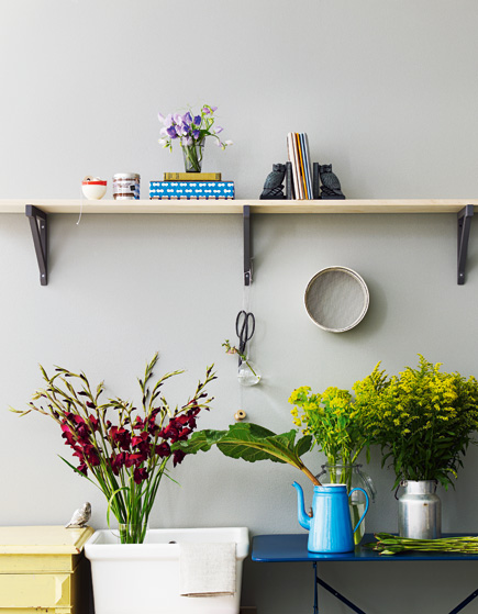
As a home owner, I don't think there is a single object from Muuto that I would not enjoy having in my apartment. As a designer I count Muuto among the brands that I aspire to work with one day. They now have a Pinterest account which I started following the instant I heard about it. That's where these photos are from. I love the grey color palette with the occasional yellows and greens.

Bir ev sahibi olarak; Muuto'nun ürettiği ve benim evimde sahip olmaktan keyif almayacağım tek bir obje yok. Bir tasarımcı olarak; Muuto kesinlikle bir gün çalışmayı hayal ettiğim markalar arasında. Artık  Pinterest'te olduklarını duyar duymaz tabii ki takibe aldım, bu fotoğraflar oradan. Aralarda sarı ve yeşillerle canlandırılan gri renk skalası çok güzel.

This post is NOT an ad, it's my honest views. This is an ad-free blog. / Bu yazı reklam niteliği TAŞIMAMAKTADIR, kişisel görüşlerimden ibarettir. Bu blogda reklamlara yer yoktur.

Tuesday, May 29, 2012

Lys Vintage + Janne Peters


Look at this home, it's mostly gray but far from being dark and dreary. It's a well thought out space, with enough details to make it homey but not cluttered. Peaceful and spacious but not cold.

Above, half way up gray paint. I have been seeing that a lot lately and each time think it looks great.

Bu eve bakın, neredeyse tamamı gri olmakla beraber karanlık ve kasvetli olmaktan uzak. İyi düşünülmüş bir mekan burası, yuva sıcaklığına sahip ama karışık ve kalabalık değil. Huzurlu ve ferah ama soğuk değil. 

Üstte, yarı yüksekliğe kadar griye boyanmış duvar. Bu uygulama son zamanlarda çok sık karşıma çıkar oldu her seferinde de harika göründüğünü düşünüyorum.


Vipp bin on the left. Wishbone chair on the right. 

Solda Vipp çöp kutusu. Sağda Wishbone sandalye. 


Wishbones and sheepskins appeal to my primal senses, I will never grow tired of this look.

Wishbone'lar ve koyun postları ilkel güdülerime hitap ettiğinden bu görüntüden ömür boyu sıkılmayacağım sanırım.


I prefer my books arranged by genre/publisher/author in that order and usually find color-coding books a bit superficial, but in this home it's good to see these blocks of colors.

Kitaplarımı janr/yayınevi/yazar sırası ile düzenlemeyi tercih ederim ve renklere göre dizmeyi biraz sığ buluyorum, ama bu mekanda renk blokları görmek iyi geliyor.


With a quick search I have identified the beautiful bird prints on the wall. They are by illustrator Charley Harper and were commissioned by Ford Times in the 1950s.

Ufacık bir arama ile duvardaki kuş resimlerinin sahibini tespit ettim. İllüstratör Charley Harper tarafından 1950'lerde Ford Times dergisi için çalışılmışlar.


Photographs of Lys Vintage by Janne Peters.

Wednesday, January 18, 2012

House of Teal


The designers behind Dimore Studio, Britt Moran and Emiliano Salci have taken a Milanese palazzo and made it their home/studio. It's a cold looking space, quite elegant, very original. I'm a bit tired of beautiful yet look-alike spaces so it is a breath of fresh air for me to see this. It's also interesting to see my second least favorite color (after orange) -teal- looking rather fabulous. I'm particularly taken by the beautiful carpet seen in the photo above. It reminds me of blue and white china. The coffee table I also find gorgeous.

Dimore Studio'yu oluşturan tasarımcılar Britt Moran ve Emiliano Salci, Milano'da bir palazzo alarak buranın alt katını stüdyo, alt katını ise evleri olarak düzenlemişler. Soğuk görünümlü bir mekan burası, oldukça zarif, epey orjinal. Güzel lakin birbirinin aynısı mekanları görmekten sıkıldığım için bu fotoğrafları görmek bana nefes aldırdı. Ayrıca turuncudan sonra ikinci en sevmediğim renk olan, tavus kuşu yeşili olarak nitelendirebileceğim bu rengin güzel kullanımını görmek ilginç oldu. Üstteki fotoğraftaki halı sanırım evdeki en hoş detay; bana mavi-beyaz Çin porselenlerini anımsattı. Sehpayı da çok güzel buldum.


More teal details in the bedroom. Notice how the wall is painted black up to a certain height as skirting.

Yatak odasında tavus kuşu yeşili teması devam ediyor. Süpürgelik yerine duvarın belli bir yüksekliğe kadar siyaha boyanmış olmasına dikkatinizi çekerim.


I have only posted my favorite images, you can see the rest at Yatzer.

Buradakiler yalnıca favori fotoğraflarım, gerisi Yatzer'de.

Photos by Emanuele Zamponi for Yatzer.

Monday, October 31, 2011

Hotel-like

Otelimsi


A quite empty, but luxurious looking apartment in Frederiksberg, Denmark. The minute I laid my eyes on this apartment, before even hitting the Google Translate button, I could tell this was a woman's home. Not because it's super neat, but because it obviously has a woman's touch.

Oldukça boş bırakılmış, ancak lüks bir havası olan bu apartman dairesi Frederiksberk, Danimarka'da. Bu daireye gözüm takıldığı anda, henüz Google Translate düğmesine bile basmamışken, bir kadına ait olduğunu tahmin etmiştim. Çok düzenli olduğu için değil de bariz bir kadın dokunuşu evin her noktasında kendini gösterdiği için.


The kitchen wall is painted gray halfway through. It looks amazing with the Artemide wall lamp and Georg Jensen metal jug. I like how the counter surface looks a bit rough. Judging by the absence of a cooker hood I doubt the owner of this apartment cooks often.

Mutfak duvarı yarı yüksekliğe kadar griye boyanmış. Artemide marka duvar lambaları ve Georg Jensen metal sürahi ile harika duruyor. Tezgah yüzeyinin nispeten kusurlu oluşunu beğendim. Davlumbaz bulunmayışından ev sahibinin pek yemek pişirmediğini anlıyoruz.


The relatively beat-up black leather armchair adds character to this incredibly neat and clean home.

Eski yüzlü bu siyah deri koltuk, her şeyin bu kadar temiz ve düzenli göründüğü bu apartmana kişilik katıyor.


The bedroom is hands down my favorite spot. The walls and ceiling, along with the old door repurposed as a headboard are all painted a perfect shade of gray. The floor lamps are once again Artemide. Very hotel-chic.

Dairede en beğendiğim bölüm açık fark ile yatak odası. Duvarlar ve tavan, yatak başı olarak değerlendirilmiş eski kapı ile birlikte grinin mükemmel bir tonuna boyanmış. Yer lambaları yine Artemide. Yatak odalarında otel odası şıklığını çok seviyorum.


Photos femina.dk

Thursday, October 20, 2011

Imaginary Bedroom Details

Hayali Yatak Odası Detayları


My bedroom might seem neglected with its empty black wall and enormous four poster bed (Ikea Edland) and nothing else, but in my mind I have decorated it at least a few dozen times. I am such a commitment-phobe that I haven't gone forth with any of the possible color schemes I have in my head. Well, grey is the destiny of indecisive people, and I think I will embrace my destiny. I mentioned before that I wanted a few throw cushions on my bed. I find the ones above very appealing.

Yatak odam bomboş siyah duvarı ve koskoca yatağı (Ikea Edland) ve içinde başka hiçbirşey olmamasıyla ihmal edilmiş gibi duruyor olabilir, ama aslında kafamda onlarca defa farklı farklı dekore ettim. Bağlanma korkum nedeniyle aklımdan geçen renk kombinasyonlarının hiçbirini uygulamaya dökmedim. Kararsız insanların alınyazısı gridir, alabildiğim tek karar alınyazımı kabullenmek. Daha önce yatağımın üzerine bir öbek yastık istediğimden bahsetmiştim. Yukardaki fotoğraftakileri son derece cazip buldum.


Here too the mix of different monochrome patterns and knits make a very cozy bed.

Burada da monokrom desenlerin ve örgülerin birleşimi yatağı sıcacık, davetkar yapıyor.


Did I mention my bed is enormous? When did everyone else's beds get so small? Because it took me months to find a large enough bedspread in Istanbul! I like lightweight ones as I like to wash often, that and the size issue meant I had to pick from the very limited options at Ikea. I finally have a very simple one in the same color as the one above, but I will not be able to sleep comfortably until I sew giant pom-poms around mine!

Yatağımın devasa olduğunu söylemiştim değil mi? Diğer herkesin yatakları ne ara küçüldü onu anlamadım. Yatağımın boyutu annemlerin evlendikleri zamanki yataklarıyla aynı, ama nedense benim yeterince büyük boyda bir pike bulmam aylar sürdü. Yatak örtüsü yerine pike tercih ediyorum çünkü üstümde ağırlık sevmiyorum ve her çarşaf değiştirdiğimde yatak örtüsünü de yıkıyorum. Yerli mağazalardakiler küçücüktü, yalnızca Ikea'da bulabildim, orada da seçenekler kısıtlı olduğu için üstteki resimdeki gibi krem rengi, sade birşey aldım. Etrafına kocaman ponponlar dikene kadar rahat uyuyamayacağım!

Photos 1 Homelife, 2 Sköna Hem, 3 Inspace via Desire to Inspire

Sunday, February 6, 2011

Fluoro Pink On Grey

Floresan Pembe ve Gri
{}
{}
{}
{}
{}
These beautiful photos are for people other than me; people whose homes aren't under renovation, whose stuff aren't stuffed in boxes, covered in plastic and a thick layer of dust. I'm psyched about finally taking the step to make my apartment my own (it used to be my parents'), but it gets worse before it gets better, right? Right?? I considered taking before shots but after I took down the pictures on the walls, the soot stains were just too horrible to be documented. Even with the dust and the plastic, I'm so relieved to have given a lot of the excess stuff away. Clothes, technologically challenged computers, furniture (including my bed, which is why I'm non-sleeping on the couch right now), books (though I still own a life supply of books, most of them previously belonging to me parents and my grandfather) are now happy in their new homes and I'm enjoying the open space and have no intention to fill it back. I'm still shocked about how stuff can be accumulated over the years; this experience has really taught me the importance of spring cleaning! My laptop is jealous of the apartment and wants to start fresh too, making my life miserable in the meantime. Expect updates to be scarce.
{}
Bu güzel fotoğraflar başka insanlar için; evleri tadilatta olmayan, eşyaları kutularda, naylon örtülü ve bir parmak toz altında gömülü olmayan insanlar için. Yer yer dökülen ve ailemin eşyaları ile dolu evimi kendime ait hale getirmek için nihayet kolları sıvadığımdan dolayı çok heyecanlıyım. Ailecek seferberlik halinde işe koyulmuş durumdayız. Önce/sonra karşılaştırması yapmak için "önce" fotoğrafları çekeyim dedim ama yatak odamın duvarındaki resimleri sökünce karşılaştığım is dikdörtgenleri (yoksa utanç kareleri mi demeliyim?) beni deklanşöre basmaktan alıkoydu. Badana boya güzel ama beni en çok rahatlatan evdeki fazla eşyayı ayıklamak, vermek, atmak oldu. Eşyalar yeni evlerinde mutlu, ben de kendi boş evimde. Bu satırları da yatağımı dahi vermiş olduğum için uyuyamadığım koltuktan yazıyorum. Pılı pırtı, mobilyalar, kitaplar (gerçi halen ömür boyu yetecek kadar kitabım var ailemden kalan), dergiler, teknolojinin gerisinde kalmış elektronikler, daha neler neler gitti. Oh be! Bahar temizliğinin anlam ve önemine bilahare değineceğim. Bu arada ev hediyesi geleneği kalksın artık, zevkime uymayan bir sürü atsan atılmaz satsan satılmaz objeyi ne yapacağımı şaşırdım. Ev hediyesiyle geleni kapıdan çevirme kararı aldım. Herkes birbirine çikolata götürsün, zira şu uğraşlar sırasında enerji ve mutluluk ihtiyacım için ne kadar çikolata yediğimi bir ben biliyorum bir Allah biliyor. 


Laptop'ım da temiz bir sayfa açmak istiyor sanırım, durumu kritik. Gözleriniz reader'larda kalmasın, post imkanlarım çok kısıtlı.
{}
1 From the new collection by Scholten en Baijings for HAY, 2-3 styled by Tina Hellberg, photographed by Magnus Anesund for Elle Interiör, 4 styled by Tina Hellberg, photographed by Per Ranungs for Elle Interiör.